
Infographic for Ben’s Thesis
As we know, Ben has been crunching his fluids data for many moons. The past 5 days though, our campsite didn’t have service, so he really started putting pen to paper for the thesis, aka fingers to keyboard.
Within the first few pages, he wants to explain how the experimental data (his pizza at Georgia Tech) relates to the simulation data (the computer models he’s been working on with the national lab in California). Both of these are going to be critical parts to his arguments, but it can get confusing with all the moving parts.
As a self-proclaimed visualization extraordinaire, I jumped at the opportunity to make an infographic for him. At my previous jobs, I did things like this all the time. Taking something abstract and confusing, and making it look simple and beautiful. I’ve loved this sort of thing ever since I won the Fire Safety Poster contest in elementary school :)
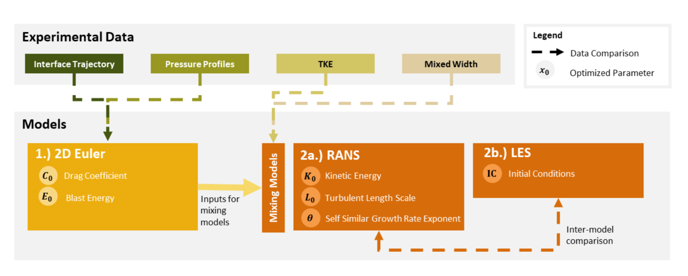
So before I show you how we got here, this is the final product! As long as his bosses give it the “ok,” this will be featured within the first few pages.

Don’t know what any of these words mean? I didn’t either! But now I know enough to give you the gist.
Big idea here is that he’s using the experimental data to “validate” the models, aka computer simulations that are recreating what Ben is physically able to do in the lab. There are 3 different models though, and they all need to be validated/optimized using different types of experimental data. Lastly, when the models are done being “optimized” the outputs are these “optimized parameters.”
Now I don’t know about you, but if I was a fluid dynamicist, reading through dense research papers, I’d just jump for joy if I saw this diagram. Think if you had to read through paragraphs explaining how all this research fits together without a visual aid!!
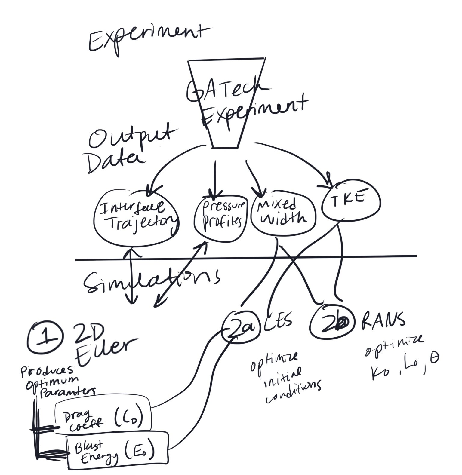
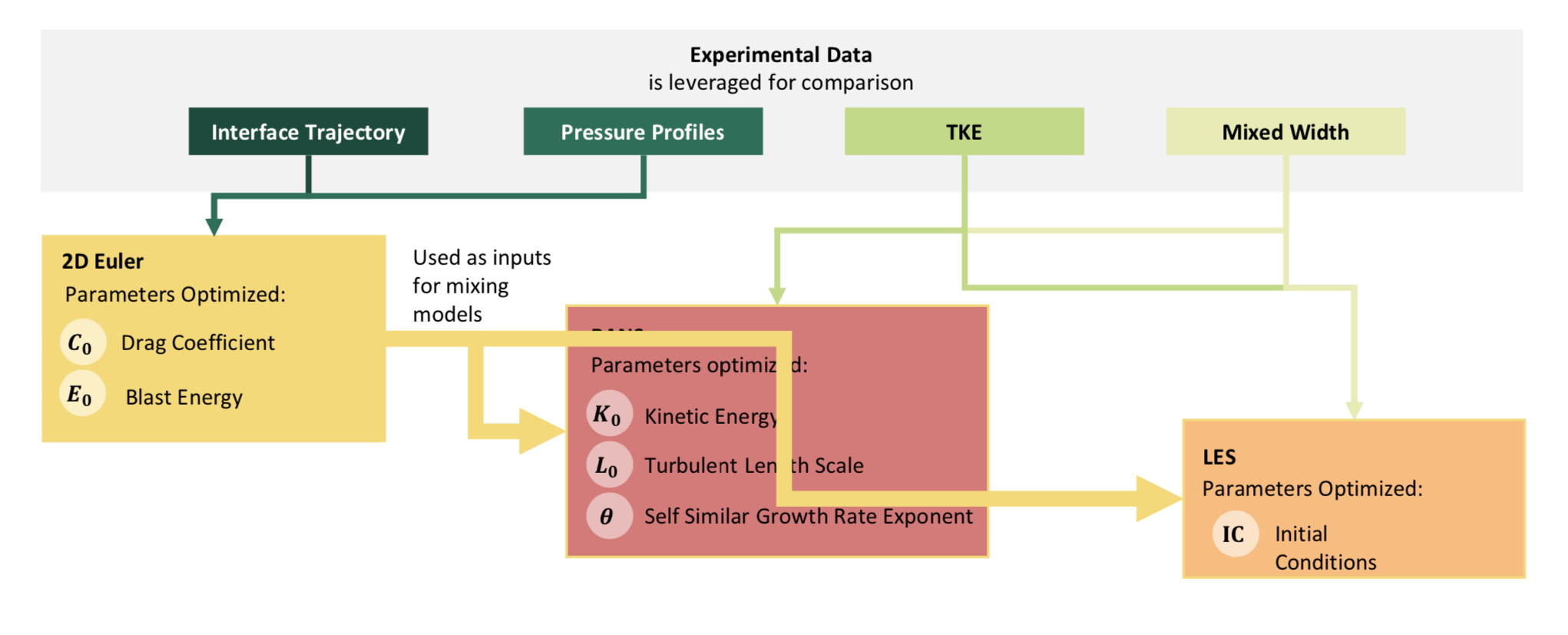
Anyway, I thought it would be fun to show you all the iterations it took for us to get here. Starting out with Ben’s prompt to me, which is nothing short of abstract and confusing:

You can see all the elements are there, but he wasn’t sure how to orient everything so the relationship arrows wouldn’t look overwhelming.
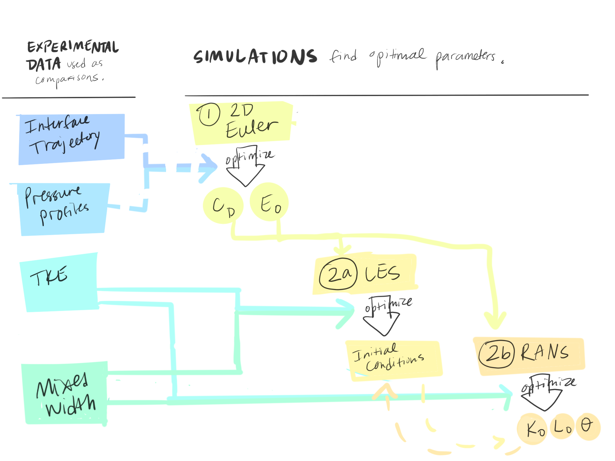
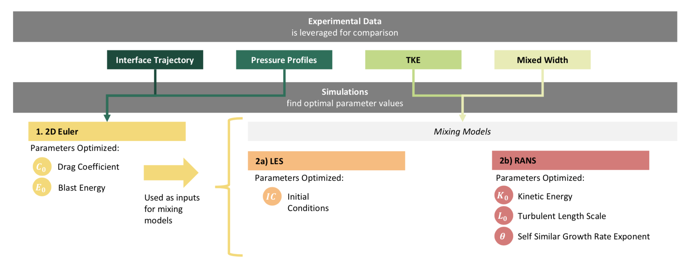
To be fair, my first draft in Procreate (drawing software on my iPad) wasn’t much better. I worked through a couple different options.

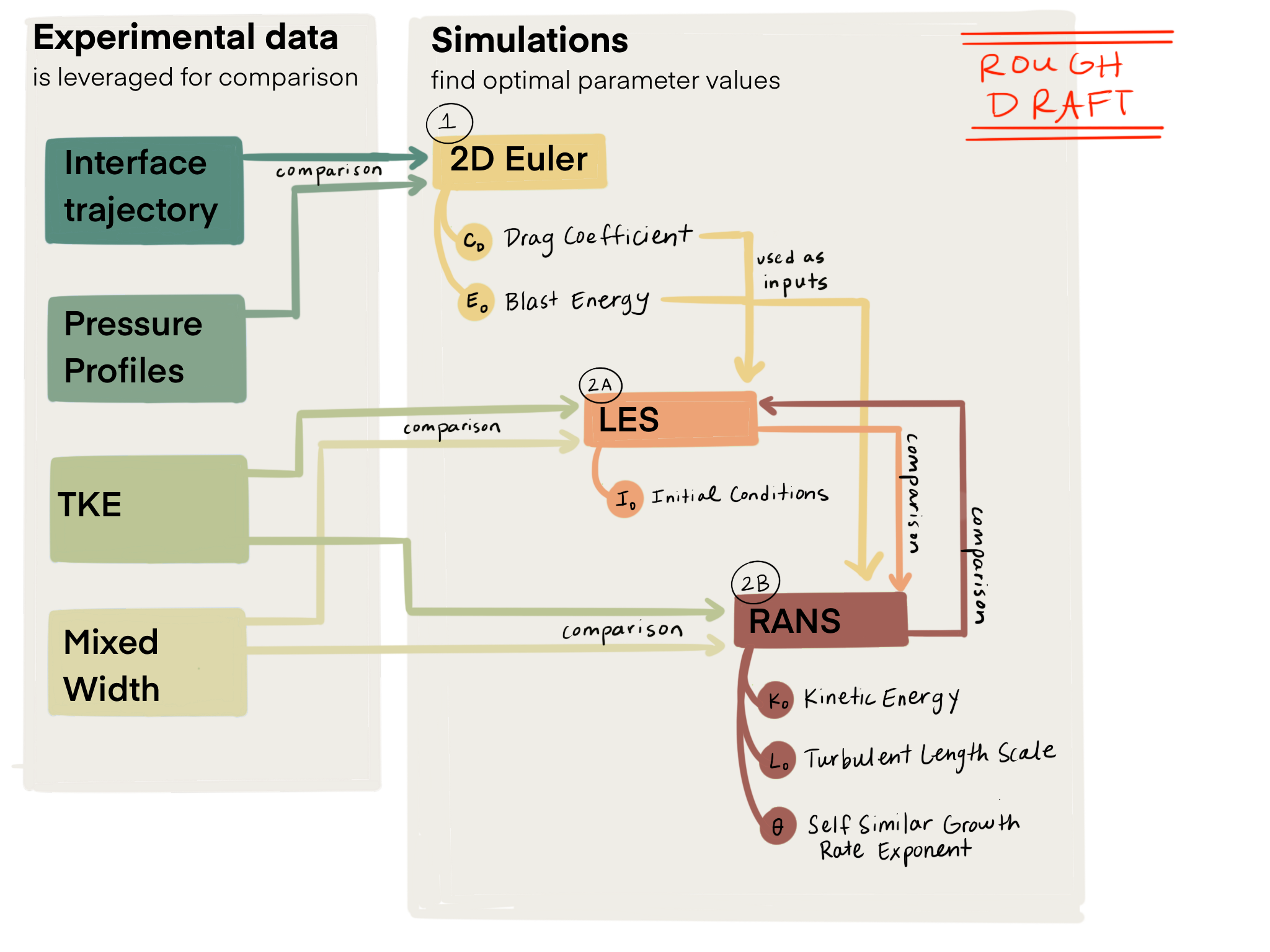
After seeing the last draft, Ben had some feedback.
First, he wanted it to be more wide and short, rather than skinny and tall. That way it would take up less room in the paper. He also started suggesting several different variations to try. I wanted to be able to test them out, so I switched to Power Point, which is much easier to iterate quickly on.
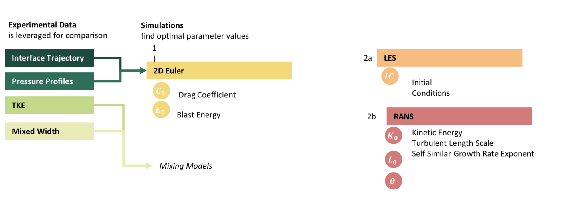
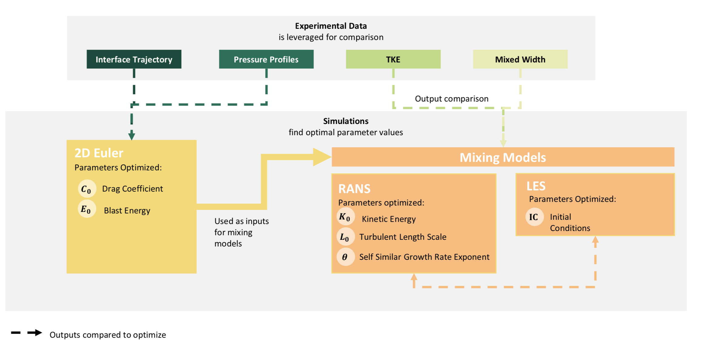
And ta da!!!

We are both really excited with how it turned out!
He was talking today about how a schematic drawing of his facility (the pizza slice and all it’s bells and whistles) might be helpful as well. So that could be coming down the pipeline soon!